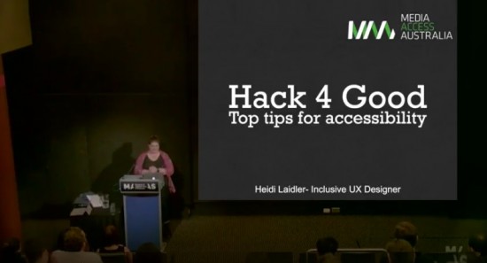
Heidi Laidler, Media Access Australia’s User Experience Designer, gave a recent talk about how to test for accessibility at a ‘Hack 4 Good’ event attended by web professionals from around the country. Discover the top tips for accessibility from a user experience point of view, in this captivating podcast article.

Listen to Heidi’s complete address where she delves into the details of how to effectively test for accessibility and incorporate inclusive design principles into your web and digital communications.
Read the transcript of Heidi Laidler’s talk on top tips for accessibility
The Australian Network on Disability (AND) in conjunction with Microsoft Australia, and with accessibility support from Media Access Australia, staged a ‘Hack 4 Good’ event in Sydney in early November 2016. At this gathering of web designers, app programmers and digital solution developers, Heidi Laidler gave an address on the subject of inclusive design and testing for accessibility.
“Usually I do a two-day workshop on this subject, and I’ve got about five to ten minutes,” explained Laidler, “so I’m going to structure it as an accessibility toolkit, with four main components.”
“The first thing you want to use is a keyboard. Keyboards are essential for all computer users but they’re particularly useful for people with motor impairment who can’t use a mouse. So if you’re making something that’s going to be run on a desktop, you need to go through that solution using your shift and tab keys to make sure that every element in whatever you’ve made is accessible and can be activated using a keyboard only.”
“The next thing I want to talk about is screen readers,” said Laidler. “There are two big ones, JAWS and NVDA. I’m talking about NVDA because it’s free and it’s pretty popular. And with screen readers, the name is slightly deceptive because they don’t read the screen, they read code generally.”
“Someone who’s using a screen reader to read a form obviously can’t see those visual hints so they need to be translated by the screen reader. The screen reader needs to say this is a checkbox. This is a radio button, this is checked, this isn’t selected, things like that.”
“Tool number three is colour contrast,” Laidler continued. “Sufficient colour contrast is essential for people with low vision, people who are colour blind and it’s also something that’s really useful contextually, so if you’re out and about and you’re looking at an app or something on your phone and there’s a bunch of screen glare, good colour contrast is really useful and that’s an example of where so much of this translates across to just being better design in general.”
“The last one is, ease of access, and they’re a bunch of settings already built into Windows which a lot of you will already have where you can basically alter different things about the way the computer words and the way it displays things to make it easier for people with different types of disabilities, and the main one is contrast settings.”
“People with low vision, in particular someone that we worked with at Media Access Australia, will use the computer on high contrast mode, which basically changes the colours that are displayed on the screen,” said Laidler. “So if you’re looking at a website, it’s going to make the, generally depending on the settings that you have, it’ll generally make the background black and the text will be like a fluorescent blue, yellow or white. You want to make sure if you’re doing a web-based thing, you want to test your site and see how it looks in high contrast mode.”
Media Access Australia offers a range of consulting services and training to help you attain optimal digital accessibility reach and compliance. You can contact the Digital Accessibility Services team for more information.
